Everything you need to know about design is on a Rs. 5 biscuit wrapper
Literally!!

Most design students spend years studying everything possible. They buy expensive books, spend hours looking for inspiration but forget that one package sitting in shelves even before their parents were born.
The Parle-G wrapper hasn’t changed in 60+ years. In an industry where staying the same is considered laziness, this is so important in the history of Indian design.
Here’s what that wrapper is teaching you, if you know how to look.
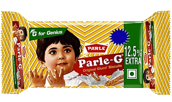
Parle Products started making biscuits in 1939. By 1947, when India became independent, the company was positioning the brand as an Indian alternative to British biscuits, a patriotic, affordable, everyday product for a newly free nation.
This design was made for a country that was largely rural, price-sensitive and needed to immediately trust something they’d never bought before. The wrapper had to communicate quality, safety, energy and Indianness, simultaneously, at the point of sale in a kirana store with no lighting budget.
What’s actually on the packet
01. Premium disguised as pattern
The most under analysed element on the entire wrapper is the background itself. Look closely, a weave pattern in gold and amber running across the entire packet.
A flat yellow background would have been cheaper to print and easier to design. It also would have looked cheap. The woven chevron pattern subconsciously references fabric, textile, craft. It gives the wrapper a tactile richness that a flat colour cannot.
The golden tone of the chevron is close to the colour of the biscuit itself creates an internal coherence.
So, when you can’t compete on size or whitespace, you compete on surface. A textured background communicates craft and intention in a way a flat fill never can.
02. “G for Genius”
Top left corner. Small green badge. Three words: G for Genius.
This is one of the most brilliant pieces of copy-design integration in Indian branding. The G in Parle-G originally stood for Glucose which is functional, descriptive, category-appropriate. But at some point, Parle layered a second meaning on top of it: Genius. Two completely different emotional registers.
For a parent buying this for their child, “Glucose” says, this gives your child energy. “Genius” says this is good for your child’s mind. The design choice to badge this separately, in green, which reads as health and growth.
So, the best brand extensions don’t replace the original meaning. They layer on top of it. One letter now carries a functional meaning and an aspirational one depending on who is reading. That kind of semantic layering is what separates a name from a brand.
03. Why the red pentagon exists
Sitting just above the main logotype band is the red pentagon with PARLE in bold white capitals.
The pentagon shape is doing specific work here. It isn’t circular or rectangular. A pentagon pointing upward carries a subtle sense of direction and forward movement. Combined with the red fill which universally communicates confidence, energy and importance creates a parent brand badge that says: this belongs to a name you can trust.
In retail environments where the wrapper is one of twenty products on a shelf, this badge functions as a guarantee.
Parent brand badges earn their place when they transfer trust that the product itself hasn’t yet built. The shape of a containing element carries personality before anyone reads the words inside it.
04. The girl
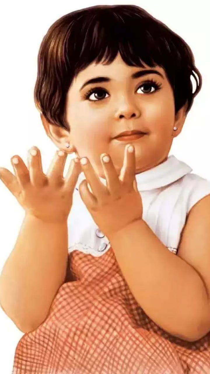
The Parle-G girl was designed in the 1960s by Maganlal Daiya, who was tasked with creating a visual representation for the brand. Unlike today’s over-analysed logo creation processes, her illustration was guided by instinct and purpose.
She’s rendered as a realistic illustration rather than a flat graphic. Chubby cheeks, wide eyes and looking directly at you. The design also featured the girl’s smiling face alongside the brand name. The girl’s image was slightly modernised over time, but her essence remained unchanged to preserve nostalgia.
Illustration gives you control that photography never can. You can make someone look at exactly the right age, with exactly the right expression, in exactly the right style and freeze it there forever. When your mascot needs to last decades, illustration is the right choice.
05. Why the serif still works sixty years later
The Parle-G logotype is a bold, warm serif. It communicates something no sans-serif can at this price point: permanence. It says we have been here a long time. It says we are not chasing trends.
The weight of the letterforms is thick enough to read from a distance on a crowded shelf, but not so compressed that it loses the warmth of the rounded terminals. This is a typeface that balances authority with approachability, which is exactly the balance a product that needs to work for both a 5-year-old and their grandmother must achieve.
Typography communicates personality before the reader processes meaning. A serif at this weight, in this context, says “trusted institution” rather than “outdated.”

Parle never changed its packaging design. This consistency benefited the brand in standing out from competition and produced high recall value among consumers.
Parle-G understood that it was selling a feeling and their most powerful decision was to keep carrying it, unchanged, for as long as the feeling was true.
Every few years, someone inside Parle must have made the argument for a refresh. And someone, every time, decided to leave it alone because it had memory.
We are trained to improve things, to iterate, to make better versions. Nobody gets a brief that says “leave this exactly as it is.”
But now I am curious: what if you were redesigning the Parle G packet? What would you do? Drop your answer in the comments.
Until next week
Anik 🧢