This can't be real
and no one is even talking about it!

Hey DZ!NRS,
You know the more I observe the design world, the more I feel we’re all pretending to chase the future while quietly running back to the past. And I actually love that.
Because if you look closely, every “fresh” redesign today is basically a brand admitting, “Hey, our original idea was better.”
Pepsi didn’t invent anything new but just remembered who it used to be.
Burger King dropped the artificial shine and went back to its warm, retro confidence.
Pringles returned to the personality it lost somewhere in the “modernization” race.
And honestly, I’ve started noticing this everywhere.
Hyundai’s new cars feel like the 80s called and said, “Let’s try again.”
App icons went 3D → flat → and now slowly going 3D again because flat got boring.
Even fashion is looping — baggy → skinny → baggy again.
Tech packaging is going from glossy to matte and back to glossy.
I feel as designers, we get too obsessed with looking “future-ready” and forget that people love things that feel familiar. The designs we call old-school were honest. They had quirks, warmth, imperfections that actually makes people feel something.
That’s why I think it is important to understand that timeless > trendy.
Good design doesn’t move in a straight line but in cycles and it returns to whatever felt human.
Everyone should do this before these 20 days end….
Do a honesty check with yourself (A real one)
I don’t mean in the “new year, new me” way. Just a simple look at the year you lived and the person you were while living it.
Ask yourself things most people never ask:
What did I tolerate this year that I shouldn’t have?
Where did I shrink myself because it felt easier?
Which moments made me proud but I rushed past them?
What did I learn about myself that I didn’t expect?
What part of my life started feeling too small for who I’m becoming?
This is because you can’t build a better year on top of patterns you haven’t even acknowledged. These 20 days are not for fixing everything but purely for noticing.
Once you see what actually shaped your year, you naturally start choosing better for the next one. It’s a long exercise, but it changes everything.

Also, just in case you didn’t know:
1. The Vimeo logo just got a makeover.
Vimeo just refined its logo and this time the update is getting a lot of attention in the design world because of how the team approached it.
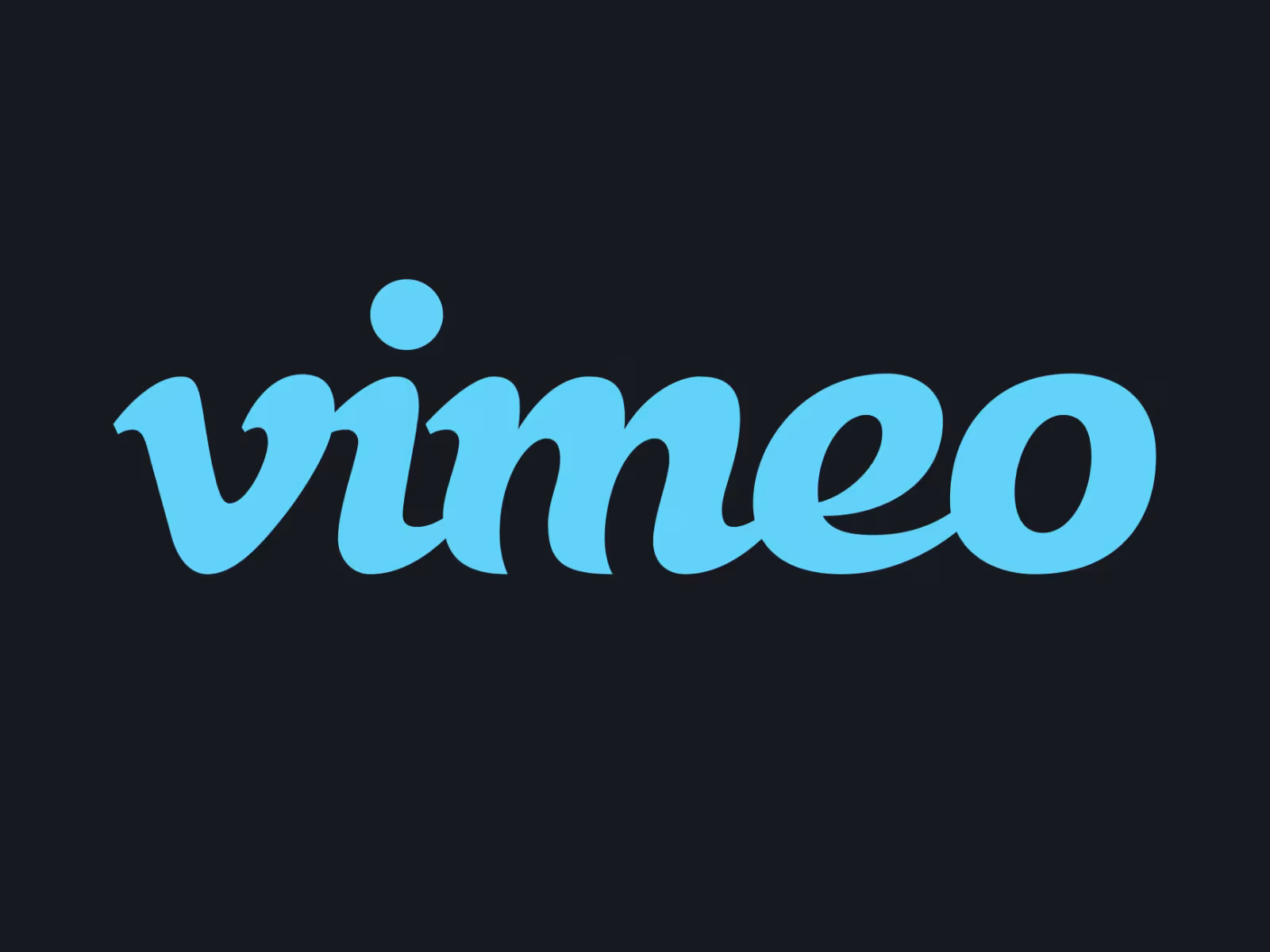
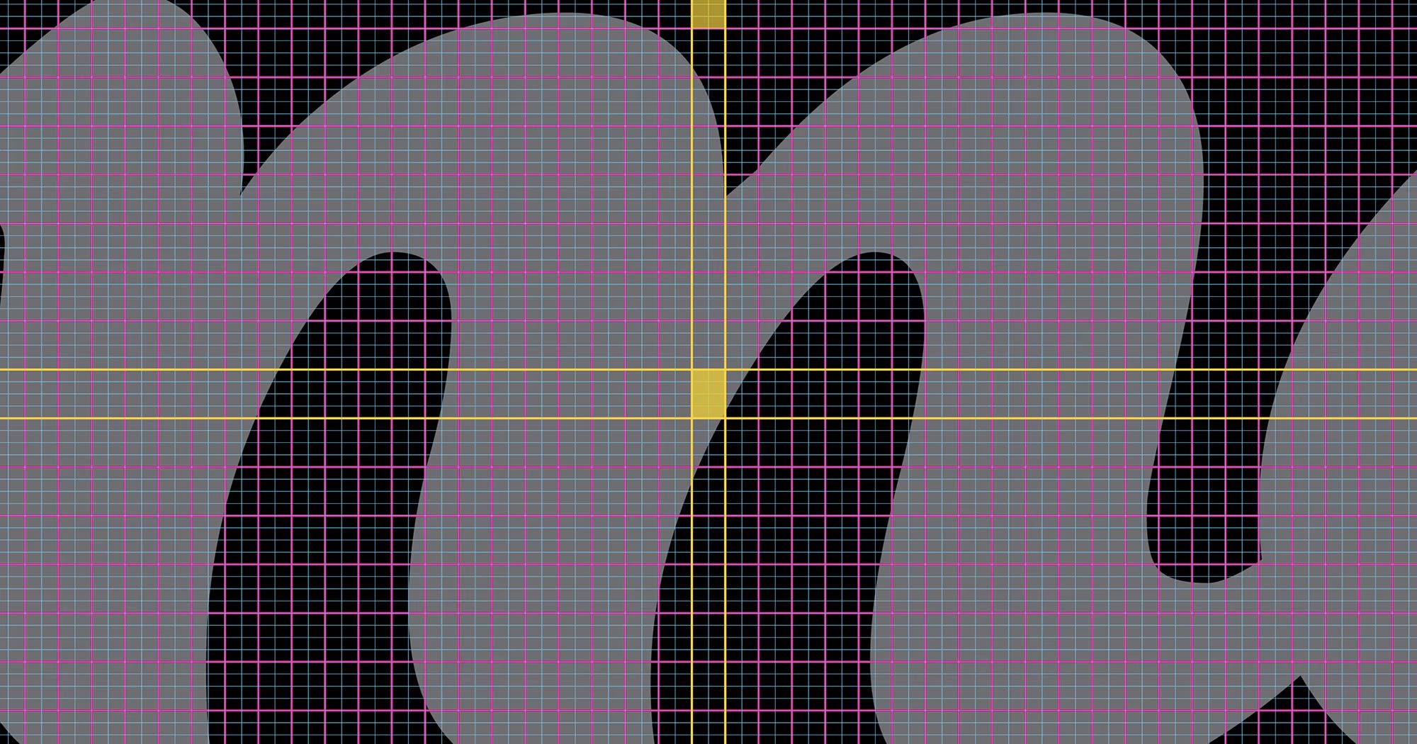
The project was led in NY, driven by Vimeo’s brand team (Dan Brooks and Via Castro) along with TOOYA, a studio known for its micro-typography expertise. Instead of “redesigning,” they treated the logo like a craft object, something to be tuned.
TOOYA applied its proprietary micro-typography analysis system to study the smallest structural nuances of the existing logo like curve tension, stroke weight variation, rhythm between letters, overall balance. Things most people never consciously notice but instantly feel.
Their goal was to keep the original charm intact while fixing the tiny inconsistencies that prevented the wordmark from scaling into a modern, high-precision identity system.
And this wasn’t even a “final update.”
The refinement is actually the foundation for something bigger, a custom Vimeo typeface that will carry the same personality across all brand touchpoints.
2. The cutest Christmas drop of the year!
Every year, brands go all out for Christmas with big campaigns, big colors and big everything.
But the most unexpectedly adorable tradition are Tiny Christmas keycaps.
Dwarf Factory just released its holiday collection, and it’s honestly so wholesome that you can’t help but grin. These are “2 cm pieces of resin” that somehow manage to bring more Christmas spirit than half the decor in your house.
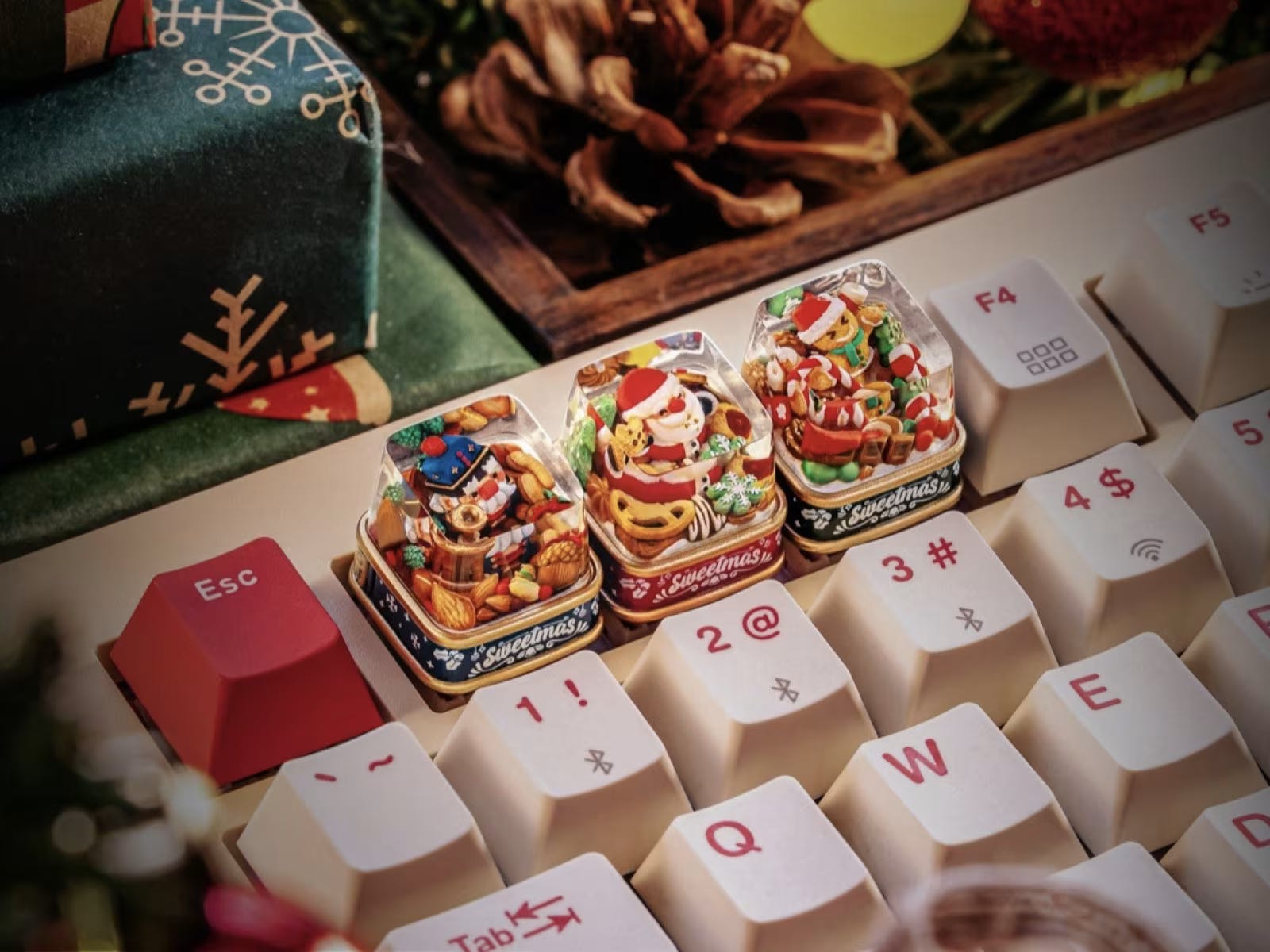
This year’s lineup has a tiny Santa, a classy Nutcracker,and a gingerbread-style character all hand-painted, slightly different and ridiculously cute. Pop one on your Escape key and suddenly your whole desk feels like it’s wearing a Christmas sweater.
What I love about this drop is how lighthearted it is. Just pure holiday joy sitting on a keyboard.
In a world where everything feels over-optimized, these little keycaps are a refreshing reminder that design can be fun, pointless-in-a-good-way, and just nice to look at.
Small objects but big vibes. That’s Christmas aesthetics done right. 🎄


And that’s all from me for this week.
If there’s one thing I want you to walk away with, it’s that design isn’t just changing but we are. Our taste, memory, sense of comfort and understanding of what “good” feels like.
The world will keep chasing the next big thing, but the real win is learning to notice the patterns underneath it all.
So take this into your week and pay attention to what’s coming back, what’s fading, and what still feels true to you. Because the more you understand why things repeat, the better you get at creating something that actually lasts.
See you next week!
— Anik 🧢