Wait… What?!
These brand decisions completely stole the internet this week.

Hey Guys,
This week felt so different.
I spent the last few days hopping across a few workshops and events in Bombay, the kind where you walk in for “inspiration” and walk out feeling like someone just switched on a new light inside your head.
But in between so many conversations, I realised something very simple about myself.
I genuinely love design…..and I love people who are obsessed with design even more.
There’s something about being in rooms where everyone cares about the smallest things. It reminded me that design isn’t just a skill but a language. And when you meet others who speak it fluently, it feels like you’re finally in the right conversation.
And the part that added the most value for me this week is that every designer I met had one thing in common, they’re not chasing perfection.
They’re chasing intention. They don’t care about making things complex. They care about making things thoughtful.
That’s the mindset that separates “good” from “oh wow, who made this?”


I genuinely believe everyone should….
Unlearn the habit of adding more than we need to.
Most of us don’t do it intentionally. It just happens. You feel something is missing, so you add one more idea.
One more slide…..One more feature…..One more explanation.
And suddenly the work becomes heavier, not better.
I’ve seen this happen across design, marketing and even communication. We confuse quantity with quality. We assume that the more we give, the more value people will see. But the reality is usually the opposite.
Some of the strongest people are very clear about what didn’t belong.
So, if you want to check yourself, ask a simple question:
“Is this addition helping, or am I adding it because I’m not sure the base is strong enough?”
It’s uncomfortable, but it forces honesty. Once you unlearn the instinct to pile things on, your work becomes cleaner, sharper, and easier for people to understand.
And surprisingly, it becomes more “you.”
It’s one of the hardest habits to break, but also one of the most freeing.
Btw, did you check what happened this week?
1. Burberry’s Dog Logo is Cute + So Bold!
Burberry just did something most legacy brands would never dare to try.
For their new dog coats, they temporarily replaced their historic Equestrian Knight with a dog-shaped version of the same emblem.
At first glance, it almost like a fun marketing moment. But if you look closely, it’s actually very strategic.
Most heritage brands guard their symbols like treasure. They rarely touch, tweak, or reinterpret them because the logo carries decades of meaning, memory and status.
Changing it even briefly feels like a risk. But Burberry leaned into that risk.
Instead of treating the logo as a sacred museum piece, they treated it like a living asset. They recontextualised it and that’s what makes the move clever.
It keeps the heritage intact while allowing the brand to step confidently into the fast-growing luxury pet market without looking forced, gimmicky, or over-engineered.
Brands talk about being bold, but very few actually touch their core identity to prove it. Burberry did and it paid off.
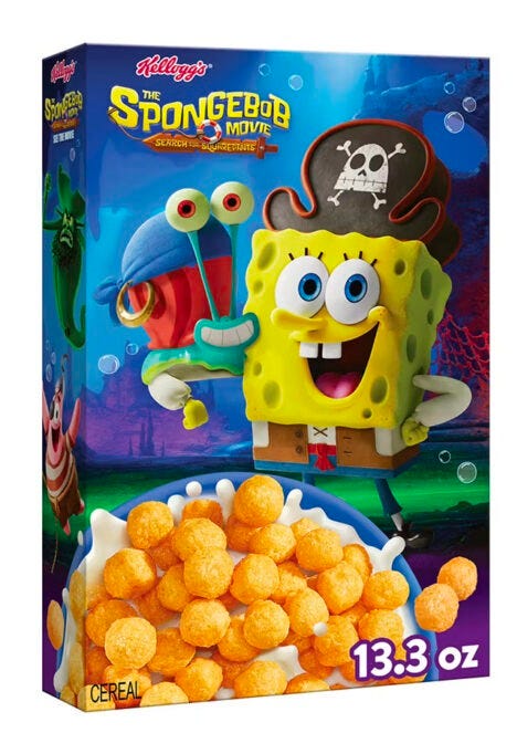
2. Did Kellogg’s turned nostalgia into a real product?
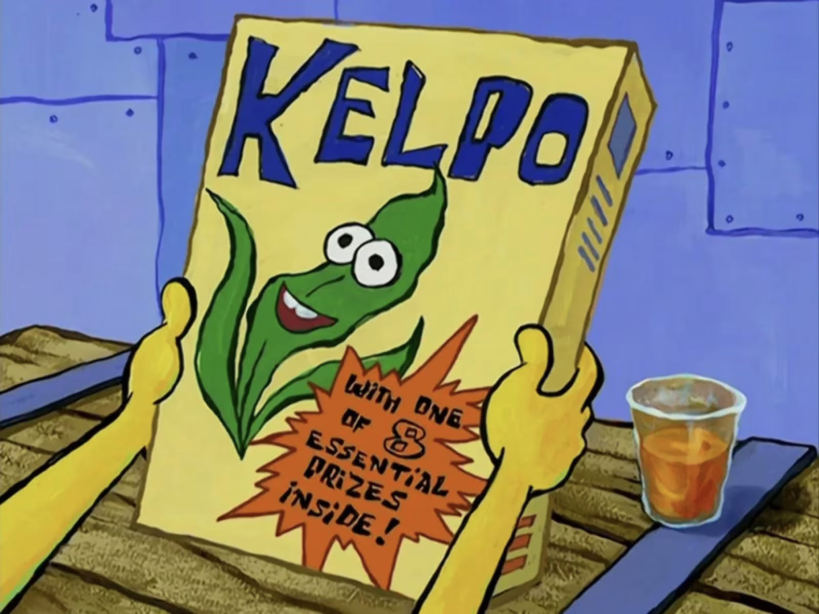
Kellogg’s just made a fictional food item from SpongeBob SquarePants real.
They launched a limited-edition Kelpo cereal, the same seaweed-based breakfast seen in the show now on shelves at Walmart and Kroger across the US.
And the most interesting part is that they recreated it.
The box looks almost exactly like the cartoon version, the bright yellow base, the oversized blue logo, the goofy seaweed mascot. It feels like someone lifted the design straight out of an animated frame and placed it in a supermarket aisle.
For anyone who grew up watching the show, it is instant recognition.
Even the cereal texture and flavor echo that animated crunch, sweet corn puffs that fans say feel like a real-world version of what they imagined Kelpo might taste like.
Food creators on social media are pushing the hype further with reviews, photos, and taste tests.
Nostalgia is doing its job and that’s what makes it clever. This is how nostalgia marketing works when it’s done with respect for the source.
Can you find out what these really are?
Let’s play something fun. I’ve scrambled a bunch of design words and I want to see how many you can crack. Take a shot at them, challenge a friend and let’s see who solves it first.
GYPHOTYPAR
TNIADEGR
RCHHYEIRA
AESPCEHTIW
VOOENCRINS
Drop your answers in the comments… let’s see who actually pays attention to the details.
That’s it for this week’s edition.
It’s been a strange mix of learning, observing, playing, and realising again how design has this funny way of showing up everywhere when you pay attention. I hope something here made you think a little deeper or look a little closer.
DM me your thoughts, would love to think deeper on them!
Till then, stay curious and keep noticing the details.
— Anik 🧢
Typography
Gradients
Hierarchy
White space
Conversions
TYPOGRAPHY
GRADIENT
HIERARCHY
WHITESPACE
CONVERSION